The importance of UI/UX design to running a successful mobile app cannot be overstated. The attentive design increases the chances that the user will not leave the application and continue the interaction that is so necessary for any business.
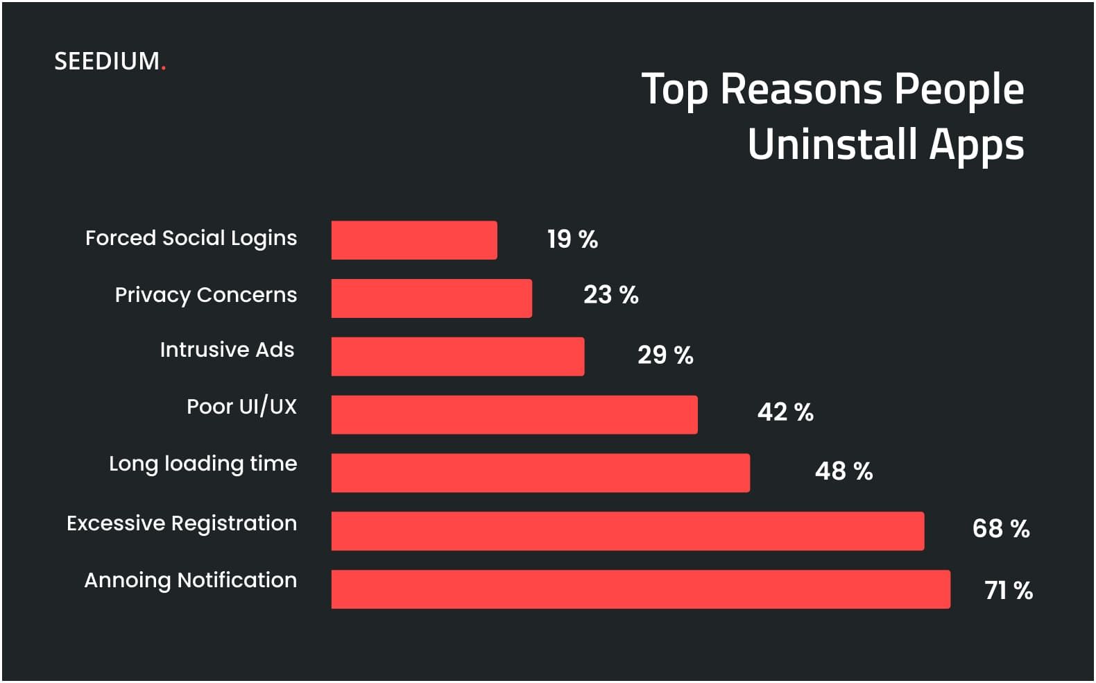
According to statistics, about 25% of users leave the application forever after the first use. Moreover, 42% of people indicated that the reason for uninstalling was a bad user interface (UI) or a poorly designed user experience (UX). At the same time, the re-downloading application is an exception rather than a common practice. Knowing the basics of mobile application design, you will be able to create a product that will interest the client and satisfy all his needs.
Therefore, the creation of mobile design should be treated with special attention. In this article, we will look at the most common design mistakes, as well as analyze the main UI/UX principles and trends for creating a successful mobile application.
An Introduction To Mobile App Design
When we talk about web design, we usually imagine only the visual component, i.e. colors, fonts, button sizes, and page design. However, effective design is much more than that. It provides ease of use and includes a harmonious combination of interaction logic and visual design to achieve the target action on the part of the user.
The designer must think through the entire user journey from the initial screens to the completion of targeted actions, which may be several. As a rule, the user journey is a set of functions with various options for interaction: subscription to the application, contacting the support service, reading the text, paying for the product, and so on. And every action must be well thought out already at the prototype stage.
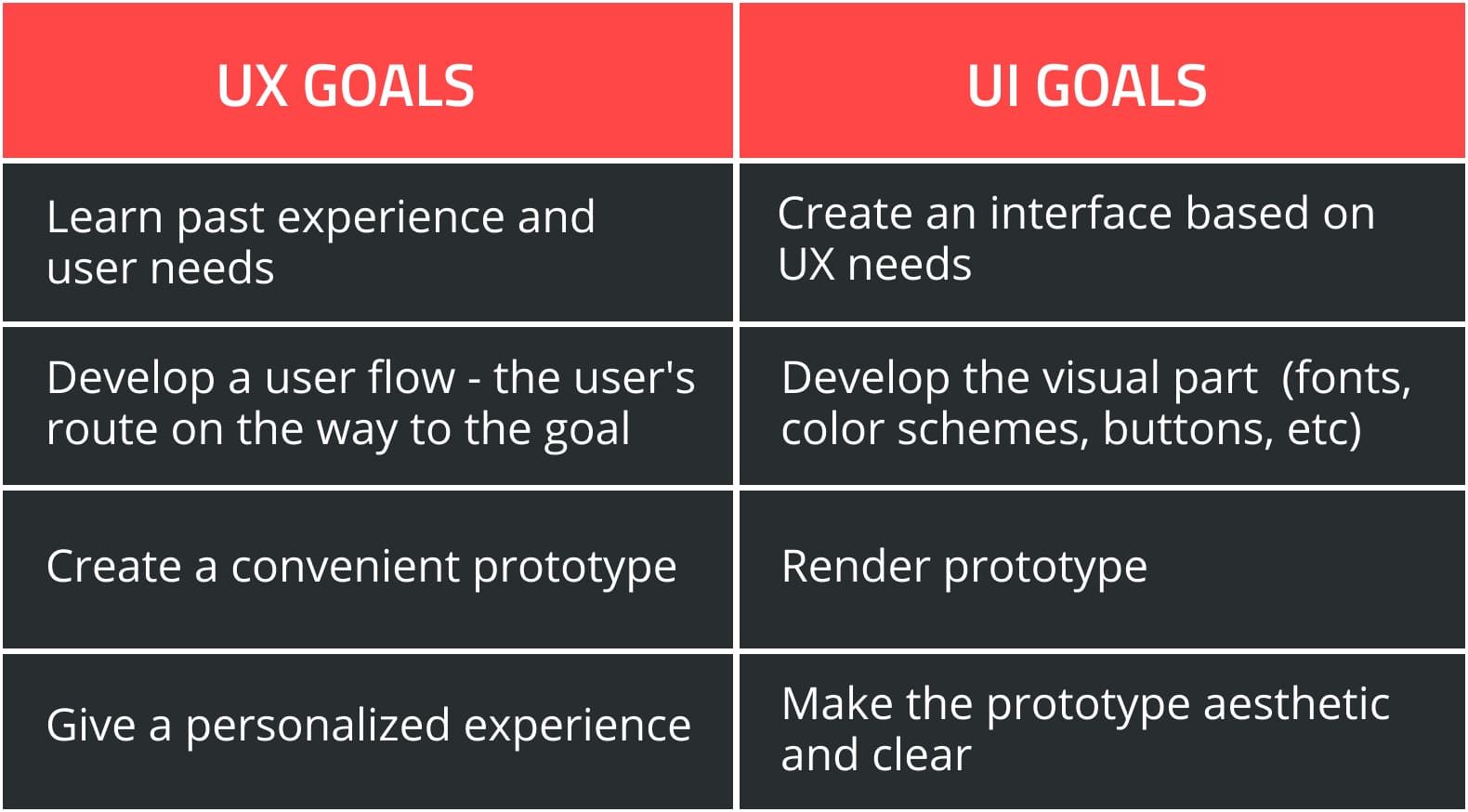
UX design is responsible for the functionality, adaptability of the product, and the emotional response of the user that occurs as a result of interaction with the interface. A well-thought-out design ensures that users get the desired result, which increases the probability of achieving the target action.
Thus, UX design includes the analysis of user needs, produces the logic of the interface, and UI is directly the process of visualizing a prototype based on these studies and UX logic.
In other words, the final UX design is not a beautiful and useful form of the web product, but thought out and designed as a working prototype of the user's path from the entry point to the target. And only at the stage of creating UI design, buttons, icons, forms, and other components are drawn, and assembled into a harmoniously working layout. However, despite the marked differences, UX and UI are very closely related and in practice, the line between these concepts is usually blurred.
Mobile App Design Features To Consider
By downloading any application, the user is loyal by default: he has already taken the intended action, and if he can solve his problem with your service, he will use it on a regular basis. However, if at least one step of the client's path does not work or is inconvenient - the person will simply delete your program - and never return to it.
The development of an application for mobile devices is different from other software products and must take into account certain specifications, including:
Small screen size. On the screen, even a small laptop fits more design elements than a mobile. To make mobile navigation convenient, it is necessary to display content compactly and reduce the gadget owner's path to the needed information.
Touch control. Smartphones do not have a "mouse" - everything is controlled by clicks. Therefore, elements for touch navigation (for example, buttons) should be made comfortable for fingers. In addition, you need to make sure that the placement of important elements is at the bottom or in the center - so it is more convenient to control the interface while holding the phone in one hand.
Cross-platform development. If you plan to make the application available for use on Android and iOS, you need to create a design that considers the features of both operating systems. When developing an app using a cross-platform framework, for example, React Native, customize the interface carefully. You can change the behavior of components — but only where necessary. When inventing new features, check that they work equally well and that the interaction with them does not cause questions. In addition, there are elements that look and work differently on platforms but perform the same function. Therefore, it is advisable to leave them native.
The Most Common Mistakes In Mobile App Design
In the creative work of a web designer, it is not easy to follow generally accepted rules. In fact, sometimes it is much more convenient to know what not to do. If you don't want your application to be banned after the first use, first of all, avoid these design mistakes.
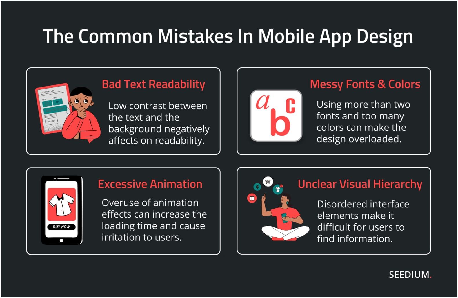
Bad text readability
If the contrast between the text and the background is insufficient, it negatively affects on readability. The minimum contrast ratio for normal-sized text is 4.5:1. In addition, the text placed on top of the photo can merge with the background, so in this case, you need to take care of the overlay.
Using more than two fonts in the design
Typically, web design includes two different fonts: one for headings and one for body text. Using more than two fonts in the interface can make the design overloaded.
Too many colors
As with fonts, too many colors can make a web design look messy. It's like you're sending too many signals to the user at once. User interaction with the interface becomes much more pleasant if the color palette is limited and colors are used uniformly for text, buttons, menu icons, and functional elements.
Unfocused visual hierarchy
If all elements in the interface are ordered, it is easier for users to find information. Use size, color contrast, and spacing to separate elements from each other and make some of them stand out the most. In general, the more important an element is, the more attention it should attract. And the buttons with calls to action must be highlighted primarily.
Excessive Animation
Overuse of decorative animation effects can increase the loading time of the application and cause irritation to users.
To avoid these and other possible mistakes when creating a design, it is better to use the services of a proven mobile application development company.
The Seedium team has been specializing in creating mobile and web applications of various complexity for many years. We know how to create an effective mobile web design that will meet the needs of your business as much as possible. Regardless of the company's industry, we help our clients find a common language with the audience through creative web solutions for startups and businesses.
We focus on quality, so we take into account absolutely every detail: from the professional selection of colors, fonts, and drawings to the detailed logic of the user's interaction with the application. You can be sure that your project will be implemented in full compliance with all the requirements for creating a first-class product.
Tips To Build An Essential Mobile App Design
Most users evaluate an application primarily by its appearance. These few simple rules will help make your product more convenient and attractive for the client.
Keep Navigation Easy
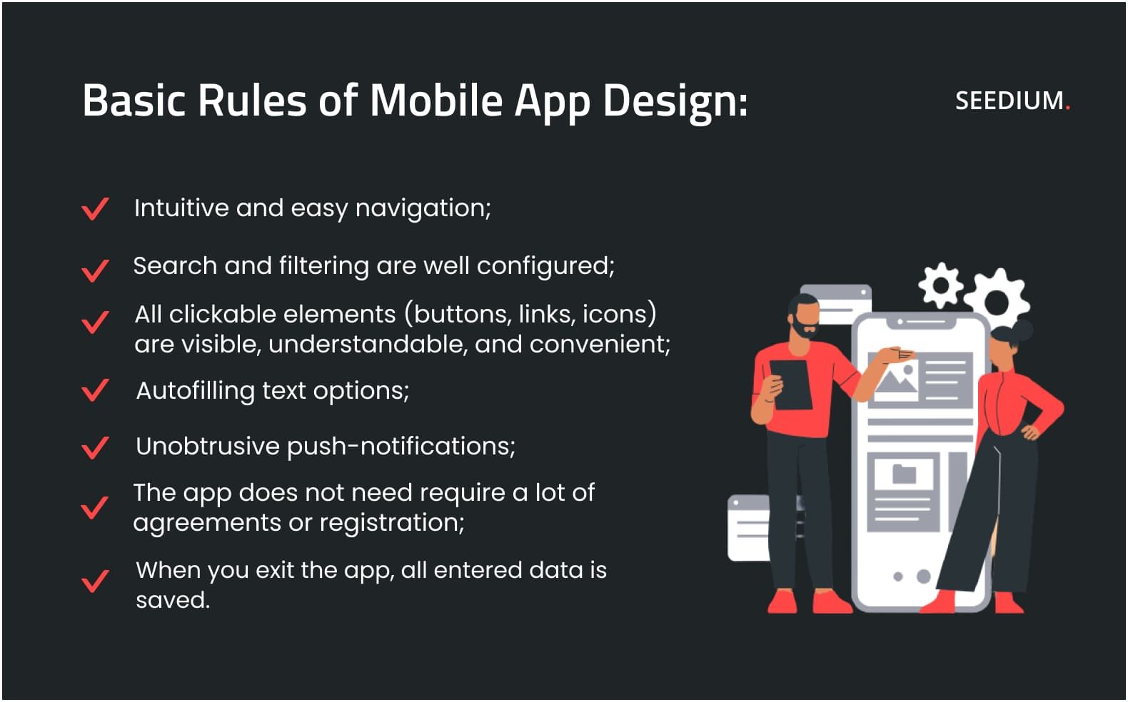
User-friendly navigation is an essential way to improve customer interaction and should be as simple and intuitive as possible. After all, the user must clearly understand where to go and how to move in order to achieve the desired result.
Take care of access to any information in a maximum of three clicks. It is also necessary to leave the person, if he is distracted, the opportunity to return and finish the task without starting over.
Don't overdo it with gestures to control the app. They are relevant only as additional functions, not the main ones. Also, avoid hidden navigation and stay consistent. The menu should be simple and there should always be a back button.
Follow UI Kit
The design is a kind of business card, therefore, in order not to confuse the user, it should be consistent. When creating a mobile application design, try to adhere to your branding design principles. This will become easier thanks to the use of UI Kit.
UI Kit is a set of all elements and components used in the application. It is needed so that the design looks harmonious. In addition, the design of the mobile application should resonate with the design of the main site, and contain visual elements already familiar to the user. If you do not use a UI Kit, your interface will look like a cocktail of different buttons, elements, and styles, which can confuse the user.
Add Text Autofill
Due to the small size of the screen, it is not very convenient to add text to various registration forms on mobile devices, so you should take care to reduce manual text typing. This can be done through text autofill, smart offers option, quick category selection, etc. Also, remove all unnecessary fields from forms to make them easier to fill out.
In addition, it is worth taking care that users can move gradually. For example, when filling out an order form, it is much easier to enter data in several steps: delivery address, payment information, etc.
Take Care of Clear Prompts
Another important component of successful design is the elements for intuitive interactions with users. They should inform about action status or errors in clear and concise language, for example, a progress bar or preloader will reduce the likelihood of confusing your audience.
Use Built-in blur
The background layout is one of the design techniques that add convenience to mobile applications uses. Even a well-designed mobile app interface sometimes can have problems running in the background.
Depending on what background users choose for their devices, and how many icons or widgets are there, the transparency can make the app difficult to read. Using the blur effect in your design will make your mobile app more readable and easy to use in the background layout.
Be Careful With Innovation
Many newcomers want to offer something creative to the market, and as a result, create solutions that are hard to intuitively understanding. Try to follow well-known rules of navigation, markings, and interaction logic to avoid confusing the user.
Regularly Collect Feedback
An important stage of UX design is the usability testing of the product. It includes evaluating the design on numerous parameters, in particular, the achievement of goals and user satisfaction. For the best result, consider the reviews of real users. Regular testing and consideration of feedback will help to improve the app design and make it more convenient for users.
Top 5 UX/UI Mobile App Design Trends 2026
An essential part of creating a mobile application design includes a detailed analysis of design trends. Ignoring the latest tendency in UX/UI inevitably leads to a drop in the efficiency of the web product, which causes a significant loss of profit and even can lead to the failure of the small business.
At the same time, most concepts are popular for a short time. Design trends are fast-moving, so it is not rational to implement all of them. You should use only useful elements or ideas for your app, depending on its purpose and audience.
So let’s discover the latest trends in mobile application design.
Minimalism
Minimalism in web design allows for a free space without unnecessary elements. Well-placed accents can help to control the user's attention and lead him to targeted actions. The main goal of the minimalist style in design is to achieve a combination of functionality, convenience, aesthetics, and atmosphere.
Since users spend a lot of time online, it becomes important for them to get information quickly and easily. Various decorative elements become a distracting and annoying factor, which decreases traffic. Minimalist UI models will help to avoid this.
Navigation has also undergone changes toward simplicity. Web products often create with only a few types of buttons and use the scroll down.
This trend has already started to improve the usability situation. The fewer questions a user has about navigation, the more time he will spend on the app or website.
Animation
Animated details in the interface, especially where they are relevant, will be a big plus. However, it is important to remain unobtrusive.
With the help of an animation, you can highlight important things and place accents. For example, you can animate buttons, icons, and transitions to make user interaction with the application better, easier and clearer. The animation will help emphasize the uniqueness of the product and increase conversions and sales.
3D elements
3D technology is becoming more and more accessible and widespread. Probably you have already encountered 3D models of goods that can be viewed at an angle of 360°, parallaxes with scrolling three-dimensional animations, and many other elements on various sites. The potential of such technologies is huge and will continue to develop. So, for example, VR/AR technologies are gaining popularity, adding effectiveness to three-dimensional elements due to augmented reality. Also, 3D icons are becoming more and more popular, replacing boring flat icons.
Until the spread of virtual reality, 3D images will remain the best way to create the effect of presence.
Virtual assistants
Among the popular technological trends of UX/UI design in recent years are voice chatbots and virtual assistants. A voice assistant is an effective tool for increasing user experience and successful implementation of projects. Its use will distinguish your app from other Internet resources and expand the reach of the audience.
In particular, virtual assistant usage can lead to a number of positive moments, in particular, it will help in quick information search, contactless navigation on the page, and free management of various options.
Immersive page scrolling
Motion design plays an important role in creating immersive page scrolling. Today, many designers still emphasize what order of content should be used to present information in the most understandable way for users. However, videos and animations were not enough to bring the site to life.
The immersive scrolling offers many opportunities to create exciting stories. And it's worth taking this approach, especially on landing pages.
In addition, with Javascript animation libraries, and native implementations, it's easier than ever to create smooth animations and customize the scrolling behavior of components. The content presentation can now be more narrative-driven, and designers have full control over how users see it.
Conclusion
UI/UX design is critical to the success of your mobile app and should be primarily about ease of use. Often mobile app design is created without the client's convenience in mind. So before you start working on a mobile app design, make sure you have a full understanding of your audience's needs.
To improve interaction with the user, designers increasingly apply a minimalist approach to design, and all trends come down to maximum functionality. So take care of the concise design, logical navigation, loading optimization, and easy engagement with information blocks.
At the same time, it's important to keep an eye on the latest trends to maintain your traffic, ranking, and page performance. This will help create a bright product and stand out from the competition.
At Seedium, we provide both UX/UI design and mobile app development services. Feel free to contact us to start a project.
